Byline: Phil Baker
For a while now I’ve thought that sameness in branding is overrated – gone are the days where brands could rely on the same static identity for decades at a time – the surge in popularity of variable fonts are set to put the era of the monolithic brand to bed. That’s if the latest report from Monotype is anything to go by.
The big cheese when it comes to type foundries, Monotype have predicted that we’re about to see a much more varied approach to branding over the next decade as the popularity of variable fonts increases.
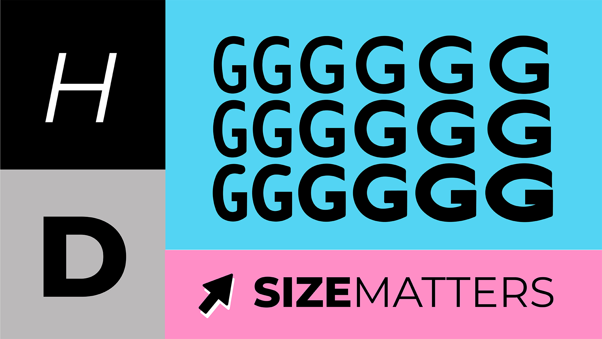
Interesting stuff, but what even is a variable font?! In layman’s terms, a variable font is a single font file that behaves like multiple font files; it has an infinite flexibility of weight, width and other attributes. As a designer this is music to my ears.
In an age where the number of touch-points between brand and consumer is ever-increasing, the hardest thing for a brand identity is to communicate consistently and clearly across all channels, which is important when trying to create a cohesive brand experience for the consumer.
Where variable fonts really come into their own is in the digital workspace, allowing brands to go where no brand has gone before. Speed is the most critical aspect when viewing content on the web, all font files must load into your browser in order to render a web page, and more often than not this can amount to lots of data. Therefore designers are restricted to using fewer fonts and font weights as a trade up for speed. The typical scenario would be to use three-to-five different fonts throughout the entire site’s design, often limiting the true voice of the brand.
The advent of variable fonts changes that entire dynamic. A full family of styles in one small optimised font file removes the performance barrier and opens up endless possibilities. Designers will have free reign when it comes to fonts on the web. This involves the ability to tweak weights and styles for every level of text, add varying degrees of texture or even create interactive letterforms.
Another interesting aspect of variable fonts is the reading experience itself. Variable fonts can be programmed to respond to the environment, user or device. For example, for users with visual impairments we can tweak the contrast of a font, making it bolder without affecting the integrity or structure of the font itself. Never before have fonts been so inclusive.
As we enter a whole new era in typography, it’s a hugely exciting time to be a designer. Truly responsive type is almost at our fingertips, and with that we’ll see the end of traditional branding, which often struggles to keep up with the pace of the modern marketplace. Just imagine a scenario where a logotype has the ability to flex depending on a user’s location. They step off a plane in Tokyo and the logotype on their screen suddenly morphs into Japanese characters.
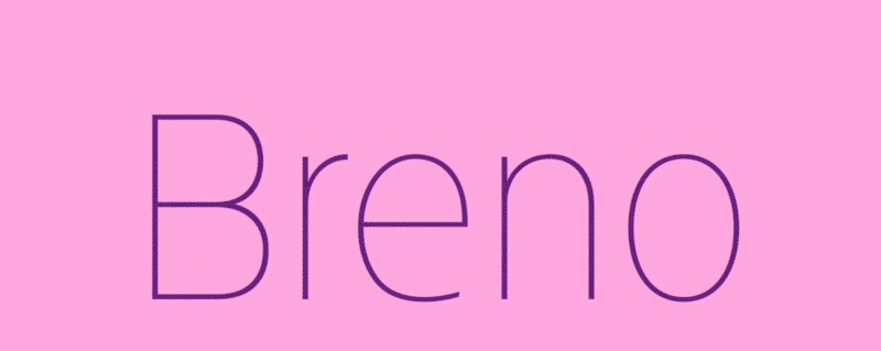

(Image credits: www.mediatemple.net)
Phil Baker is Head of Design at HDY Agency — an award-winning content marketing agency that specialises in creating incredible stand-out content.
Boasting a senior team of channel experts, HDY’s services include strategy, planning and creative services bolstered by an in-house production team, counting videography and photography amongst their strengths. Added to this, HDY has specialist teams working across digital, CRO, PR, social media, influencer engagement, event and promotions.
HDY is the fastest-growing consultancy across the West Midlands, based in Digbeth, Birmingham’s buzzy creative quarter.

